Quick Answer
The best porcelain wood look tile balances a convincing wood visual with hard performance data. For most luxury residential projects, look for water absorption below 0.5%, a PEI rating of 3 or higher, DCOF of at least 0.42 where wet slip resistance matters, rectified edges, and strong pattern variation so the floor reads like wood instead of repeated print.
You’re probably trying to get the warmth of wood without signing up for water damage, surface wear, or constant upkeep. That’s exactly where the best porcelain wood look tile earns its place, especially in kitchens, baths, patios, and busy family spaces across the Monterey Peninsula and similar coastal climates.
The problem isn’t finding a tile that looks vaguely like oak. The problem is choosing one that still looks right after layout, grout, daylight, pets, and daily traffic all expose the weak spots.
Why Choose Porcelain Tile Over Natural Wood?
A designer is specifying flooring for a coastal kitchen that runs into a breakfast area, a powder bath, and a covered patio. Wood may look beautiful on the sample board, but the key question is how that floor will behave once wet shoes, chair movement, sunlight, and cleaning cycles become part of daily life. In that kind of project, porcelain usually gives the cleaner specification.
Porcelain earns its place because it solves practical problems without giving up the warmth clients want. It tolerates moisture, handles harder wear, and keeps its finish without sanding, staining, or refinishing. That matters in homes where the floor has to look disciplined, not just attractive, after several years of actual use.

Where wood still appeals and where it doesn’t
Natural wood still has strengths. It brings authentic grain, a softer acoustic feel, and a patina that some clients actively want. In a formal living room or a low-moisture primary suite, those qualities can justify the maintenance.
High-exposure zones are different. Bathrooms, laundry rooms, basement levels, mudrooms, and rooms with direct outdoor access ask for a material that stays stable when conditions change. If you want the hardwood perspective on that question, J.R. Hardwood's flooring guide is a useful reference because it shows where even wood-focused contractors recommend more water-tolerant floors.
Why porcelain makes more sense in high-value homes
Luxury projects are usually judged on restraint and continuity. A floor should carry through multiple spaces without becoming a maintenance problem or forcing awkward material changes at every threshold.
Porcelain helps with that. It can run through kitchens, baths, entry areas, and in some specifications even out to covered exterior spaces, which gives the plan a more consistent architectural read. It also avoids a common long-term issue with wood. Small areas of damage in hardwood often lead to localized repairs that do not blend perfectly with the surrounding boards, especially after aging and sun exposure.
Maintenance is another real trade-off. Wood can be repaired and refinished, which is an advantage in the right setting. Porcelain asks for less intervention in the first place. For many clients, especially those building a second home or specifying a busy family residence, that is the more useful advantage.
Practical rule: If a room regularly sees water, grit, pets, or traffic from outdoors, start the specification with porcelain and rule it out only if the project has a strong reason to accept wood’s limitations.
The difference between porcelain and lower-performing lookalikes
Material category matters. A wood visual printed on standard ceramic does not perform the same way as true porcelain, and that distinction should be clear before the layout, grout joint, or edge detail is even discussed.
The reason is density and firing. Porcelain is made to a tighter, harder standard than typical ceramic tile, which is why it is the better candidate for demanding residential floors. This explanation of porcelain versus ceramic tile is worth reviewing if the project team is comparing lookalike products at different price points.
A quick specification-level comparison helps:
| Decision point | Porcelain wood look tile | Natural wood |
|---|---|---|
| Moisture exposure | Better suited to wet or variable conditions | Can swell, stain, or move with moisture |
| Surface wear | Handles pets, grit, and chair movement well | More prone to scratching and denting |
| Maintenance cycle | Routine cleaning only in normal use | Periodic refinishing or repair is part of ownership |
| Material continuity | Easier to carry across adjacent utility spaces | Often limited to drier interior rooms |
| Visual character | Depends on print quality, texture, edge finish, and grout strategy | Naturally convincing |
The category itself has improved. Current wood-look porcelain is far more refined than the glossy, repetitive versions many clients remember from early generations. Better graphics, more believable surface texture, and stronger plank formats have made porcelain a serious option for high-end work, especially when the selection is done with a designer’s eye instead of a commodity mindset.
For a broader material overview, this overview of porcelain surfaces gives useful background.
Decoding the Aesthetic Details of Wood Look Tile
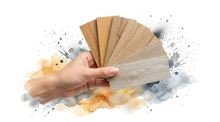
A designer signs off on a beautiful plank in the showroom, then the installed floor reads flat, repetitive, and obviously tiled. The problem is usually not porcelain itself. It is a missed specification detail. In high-end work, the difference between convincing and disappointing often comes down to format, edge finish, surface relief, and how the series handles variation across a full floor rather than a single sample board.

Plank size and format
Scale has to match the architecture. A long, restrained plank can quiet a large open plan and support cleaner sightlines through kitchens, halls, and living areas. In a smaller bath or compact secondary room, that same plank can feel oversized and staged.
The eye reads the floor as a continuous field first. Individual boards come second. That is why plank length, width, and repeat pattern should be reviewed together, not chosen as separate features. I usually advise clients to lay several pieces out on the floor in the showroom and step back. A single sample held at waist height hides the way the pattern breaks across the room.
Moderate widths tend to give the most flexibility. Very narrow planks can create visual chatter. Very wide planks ask more of the print quality and the room proportions.
If the project team is still comparing product classes, this breakdown of the difference between porcelain and ceramic tile helps frame why format options and floor applications differ.
Surface finish and texture
Surface finish is where many wood visuals are won or lost. Real wood rarely reflects light evenly, so a glossy porcelain plank tends to look artificial under recessed lighting or daylight from large windows.
The strongest collections use a matte or low-sheen finish with relief that follows the printed grain instead of sitting on top of it. That detail matters. Good embossing catches light softly and gives the floor more depth from standing height, which is how the room is typically experienced. It also changes how the tile feels underfoot, especially in kitchens, mudrooms, and baths where a little texture is welcome.
For a broader trade-oriented primer on performance, this summary of the benefits of porcelain tile is a useful companion read.
The most convincing wood-look tile looks settled in the room, not overly styled on the surface.
Color and pattern variation
Repetition gives tile away fast. If the same knot or cathedral grain returns every few planks, the floor starts to read as a printed product instead of a wood surface.
Ask to see a large display, multiple loose pieces, or several opened cartons from the same series. That request tells you more than a brochure ever will. Designers specifying for luxury residences should also ask how the manufacturer balances strong character boards with quieter ones. Too much drama across every face can feel forced. Too little variation can feel sterile.
A few color realities are worth keeping in mind:
- Light blonde and driftwood tones make a room feel open, but they expose shallow printing and weak texture quickly.
- Mid-tone oak and walnut interpretations are usually the most forgiving in mixed light conditions.
- Very dark planks can be striking, but they show dust more readily and need better lighting control to avoid a heavy look.
Edge detail and the wood illusion
Rectified edges deserve more attention than they usually get. They allow tighter grout joints, which helps the floor read more like planks and less like a tiled grid.
That does not mean every project should chase the narrowest possible joint. A luxury installation still needs enough room to accommodate the tile’s calibration and the installer’s layout conditions. The right choice depends on how true the tile is, how flat the substrate is, and whether the series has enough edge definition to stay crisp once grouted. In showroom reviews, I tell clients to look at the edge from an angle, not just face-on. A slightly pillowed edge can soften the look in traditional spaces, while a true rectified edge suits cleaner architectural work.
What to ask in the showroom
The best showroom conversations get specific fast. Ask questions that reveal how the floor will look installed, not just how it photographs.
- How many unique faces are in this series?
- Is the edge rectified or softly pressed?
- What grout joint does the manufacturer recommend for this exact plank?
- Can we see the tile under warm and cool lighting?
- Does the texture align with the grain, or is it a generic surface embossing?
- Can we review enough pieces to judge repetition across a full room?
Those questions separate decorative appeal from specification quality.
Sustainability has become part of the visual conversation
Material review now includes sourcing, lifecycle, and maintenance expectations alongside color and format. That is not separate from aesthetics in luxury work. It affects which products make the final schedule.
Porcelain often earns consideration because it combines long service life with a lower-maintenance finish in spaces where clients still want the warmth of wood. For many architects and designers, that makes it easier to specify with confidence, especially in projects where appearance, durability, and material consistency all need to hold up over time.
Key Performance Ratings to Specify for Your Project
A wood-look plank can read beautifully on a sample board and still be the wrong specification for the job. Luxury projects usually succeed or fail here, in the technical details that affect wear, slip resistance, edge quality, and long-term appearance.

PEI for wear
PEI helps you judge how well a glazed surface will stand up to foot traffic and abrasion. For a quiet dressing area, that may not drive the selection. For an entry, kitchen, or vacation property with frequent turnover, it should be part of the first specification review.
I usually tell designers to match the rating to the abuse, not to the room label. A formal dining room may see less wear than a back hall with dogs, luggage, and tracked-in grit. If the floor will deal with sand, chair movement, or regular entertaining, specify a tile with a wear rating suited to that use instead of assuming every porcelain plank performs the same.
For clients comparing materials at a broad level, this summary of the benefits of porcelain tile gives useful background before you narrow down a specific series.
DCOF for wet walking surfaces
DCOF belongs in every conversation about kitchens, bath floors, laundry rooms, mudrooms, and covered exterior transitions. A plank can have convincing grain, low repetition, and a refined matte finish, but if it becomes questionable under wet foot traffic, it is the wrong product for that location.
Ask for the tested DCOF value on the exact tile, not a general statement about the collection. That matters with wood-look porcelain because surface texture varies widely. Some lines have a dry, furniture-grade feel that works well in living areas but offers less traction once water is introduced. Others carry a more pronounced texture that performs better in wet zones, though it may read slightly more rugged under strong side lighting.
That trade-off is real.
Water absorption, body type, and sun exposure
For bathrooms, basements, spas, and indoor-outdoor applications, low water absorption is one of porcelain's strongest technical advantages. Dense porcelain resists moisture movement far better than many clients expect, which is why it holds its shape and finish so well in wet or humid conditions.
Body construction deserves a closer look too. Through-body porcelain can make sense in hard-use spaces where edges may take impact, such as pool houses, service corridors, or large-format stair landings. On many interior floors, a high-quality glazed porcelain is perfectly appropriate and often gives you a more nuanced wood visual. The right choice depends on where the tile will be cut, what edges remain exposed, and how punishing the traffic pattern will be.
Sun exposure changes the conversation again. In bright rooms with large south- or west-facing glass, ask about UV stability and whether the series is suitable for exterior or sun-drenched installations if the floor runs continuously toward a terrace.
Rectified edges and dimensional control
Rectified edges affect installation quality more than many homeowners realize. A precisely cut plank gives the installer better control over joint consistency and helps the floor read with a cleaner, longer line. That is especially important in contemporary projects where the visual goal is restraint rather than rustic variation.
Still, rectified does not mean you should force the narrowest joint possible. Long planks can carry slight warpage, and real jobsite conditions are rarely perfect. Good specification balances the tile's edge quality, the recommended offset, the flatness of the substrate, and the installer's tolerance for correction work. I would rather see a slightly wider, disciplined joint than a too-tight installation that telegraphs lippage across a full run of planks.
If the project also includes oversized wall panels, fireplace cladding, or monolithic bath surfaces, this overview of porcelain slab tiles is useful for understanding how scale and edge precision should be coordinated across adjacent materials.
What to request before you approve the tile
For higher-end residential and hospitality work, ask the showroom or rep for the data sheet, shade variation, recommended offset, minimum grout joint, DCOF results where relevant, and confirmation of whether the edges are rectified or pressed. Those details shape the installation just as much as color and grain pattern.
That is how a wood-look floor stays convincing after it leaves the sample board.
Grout Strategies for a Seamless Wood Floor Appearance
A wood-look tile floor can be expensive, carefully selected, and still look wrong because of grout. Grout is often the reason many otherwise strong projects lose the wood illusion.

Match the grout to the tile, not to the paint
If the grout is too light, the floor turns into a grid. If it’s too contrasting, every joint announces itself before the eye can read the grain.
The safest approach is usually to choose a grout that sits near the darker secondary tones in the tile rather than the palest highlight. That keeps the joint from flashing across the room. In higher-end interiors, subtlety almost always wins.
Narrow joints help, but only when the tile supports them
Rectified porcelain gives you the best chance at a tight, precise joint. Narrow grout lines preserve the length of the plank and make the installation read more like a wood floor.
That said, not every tile series, room condition, or installer preference should push to the absolute minimum. A realistic wood visual depends on overall consistency more than on chasing the smallest possible line.
Grout color, finish, and upkeep work together
Grout isn’t just a color chip decision. It affects maintenance and how the floor ages visually.
I usually advise clients to look at the selected plank under daylight, then compare grout options against the installed direction of the grain, not just against the edge of a loose sample. The floor is read in field view. That’s where mistakes show up.
A few practical guidelines help:
- Stay muted if the goal is a believable wood appearance.
- Avoid bright contrast unless you intentionally want a decorative tile look.
- Use performance-minded grout choices in kitchens, baths, and busy family spaces where staining resistance matters.
Grout should support the plank, not outline it.
For long-term appearance, maintenance matters too. This porcelain tile cleaning guide is a good reference for keeping the surface and joints looking crisp without using harsh products that create residue.
Sustainability and Sourcing Considerations
Clients who ask about sustainability usually want a straight answer, not a slogan. Porcelain has a credible case when the discussion stays grounded in sourcing, service life, and material composition.
Verified data shows that high-fired porcelain tiles can have 20 to 30% lower embodied carbon than newly harvested oak flooring, and some products include up to 40% recycled content, which can support LEED project goals, according to Wayne Tile’s summary of recent porcelain sustainability data. That won’t make porcelain the perfect answer for every project, but it does make it a serious option for teams comparing more than appearance.
What that means in specification terms
Porcelain starts with natural clay composition rather than petroleum-based vinyl content. It also offers a long service life with routine care instead of periodic refinishing cycles. Those factors matter to architects and designers who are trying to balance durability, maintenance expectations, and environmental considerations in one finish package.
For clients comparing porcelain to reclaimed or salvaged wood, the conversation gets more nuanced. Reclaimed wood has its own appeal and can be appropriate in the right setting. But if the project needs moisture resistance, dimensional stability, and a cleaner maintenance story, porcelain often becomes the more practical specification.
Ask where the material sits in the quality range
Not all wood-look porcelain is equal. The premium end of the category usually gives you better print depth, stronger edge consistency, and more believable surface texture.
That’s also the point where sourcing matters. A showroom should be able to discuss finish, body type, variation, use conditions, and sample availability without drifting into vague language. Carmel Stone Imports offers porcelain slabs and tile as part of that selection process, including wood-look options for interior and exterior applications. The useful part for a designer or homeowner isn’t the inventory claim by itself. It’s the ability to compare materials side by side and sort out what fits the project brief.
Sustainability still has trade-offs
Porcelain is fired at high temperatures. That process has an environmental cost. It shouldn’t be presented as impact-free.
What makes the material attractive in many projects is the balance. Long lifespan, low maintenance, moisture tolerance, and recycled content options can make it a responsible choice when the alternative materials either require more upkeep or don’t perform as well in the intended setting.
Style Inspiration and Application Ideas
Wood-look porcelain works best when the visual language matches the architecture. The tile shouldn’t just imitate wood. It should support the room’s scale, light, and material palette.

Coastal modern
In a Carmel-by-the-Sea setting, lighter matte planks with gentle grain movement usually feel more settled than anything too rustic or overly distressed. They pair well with limestone, pale cabinetry, and soft natural light. The goal is restraint, not fake reclaimed drama.
Refined contemporary
In Palo Alto and similar Bay Area homes, I often see designers use mid-tone or slightly smoked wood visuals to ground cleaner architecture. These tones work well with slab backsplashes, metal accents, and large expanses of glass. The room feels warmer without becoming traditional.
Indoor-outdoor continuity
This is one of porcelain’s strongest applications. A carefully chosen wood-look plank can carry visual warmth from a kitchen or great room out toward a patio without forcing a material switch at the threshold.
For clients exploring larger porcelain formats in surrounding applications, this look at why large-format porcelain is replacing stone in many projects adds helpful context. Even if the floor stays in plank format, the same design logic applies. Fewer interruptions usually make the whole space feel more composed.
Beyond the main floor
Wood-look porcelain can also work on feature walls, spa-style baths, and mudroom transitions where real wood would be harder to justify. The key is moderation. Once the material starts climbing every wall and wrapping every surface, it can feel themed instead of refined.
Frequently Asked Questions About Porcelain Wood Look Tile
Does porcelain wood look tile work outdoors?
It can, if the series is specified for that use and the finish is appropriate for exposure and traction needs. This is one of the strongest reasons people choose porcelain over real wood for patios and exterior transitions.
What should I ask for in a showroom if I want the most realistic wood look?
Ask to see the tile laid out across multiple pieces, not just a single sample. You want to judge pattern variation, edge quality, surface texture, and whether the finish still looks believable in natural light.
Is rectified tile always better for wood look floors?
Usually, yes, if your goal is a more refined appearance with tighter grout joints. But it still has to be paired with the right grout color and a layout that avoids obvious repetition.
What does through-body porcelain mean?
It means the color runs through the body of the tile instead of existing only as a printed surface layer. That can help maintain a more consistent appearance over time in higher-wear areas or where exposed edges matter.
Should grout match the lightest or darkest part of the tile?
Most of the time, matching closer to the darker secondary tones gives a more convincing result. Very light grout tends to outline every plank and make the floor look more like tile than wood.
Do I really need to see a physical sample?
Yes. Screen images flatten texture, shift color, and hide repeat patterns. A physical sample, or better yet several pieces viewed together, tells you much more about how the floor will read.
Can porcelain wood look tile be used in kitchens and bathrooms?
Yes, and those are often the spaces where it makes the most sense. Moisture resistance and easier maintenance are major reasons designers specify it there instead of natural hardwood.
Find the Best Porcelain Wood Look Tile for Your Project
The best porcelain wood look tile is the one that fits the room technically and visually. That means checking wear rating, slip resistance, edge quality, pattern variation, and how the plank reads with grout and natural light. If you’re comparing regional preferences or trying to see how wood-look tile guidance varies by market, this guide to wood look tile for Georgia is another useful perspective.
If you’d like to compare materials in person, request samples, or talk through availability for a project in the Bay Area, Monterey Peninsula, or Central Coast, visit Carmel Stone Imports at 26382 Carmel Rancho Lane, STE 100, Carmel-by-the-Sea, CA or 3160 West Bayshore Road, Palo Alto, CA. You can also call (650) 800-7840 or visit Carmel Stone Imports. Showroom hours are Monday–Friday 8:00 AM–5:00 PM and Saturday 10:00 AM–3:00 PM.